Improving customer satisfaction
Homepage research and redesign
Results
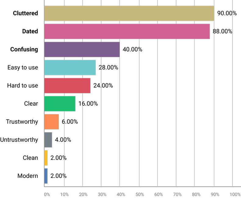
User Feedback Showed Clear Gains
Perceived Clarity - 4x more users said the new UI was clear
Modern Feel - 3135% more described it as modern
“Clean” Look - 3527% increase in users calling it clean
Less Confusion - 56% drop in perceived confusion
Clutter Perception - Dropped 89%
4 of the top 5 homepage complaints could be addressed through visual design, and save dev time
Users saw the new UI as easier to use, without changing functionality
Project Summary
Visual refresh seen by all user types, recent projects had targeted specific user roles
Introduce design system styles across shared pages
Aim to balance usability improvements with customer flexibility and configuration
Serve as a test case for aligning with the parent company’s branding
Continue with trend of scalable, research-informed UX work
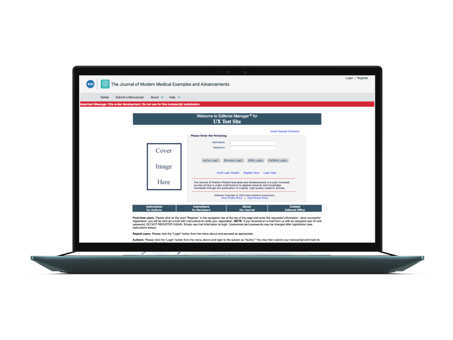
Old Homepage design
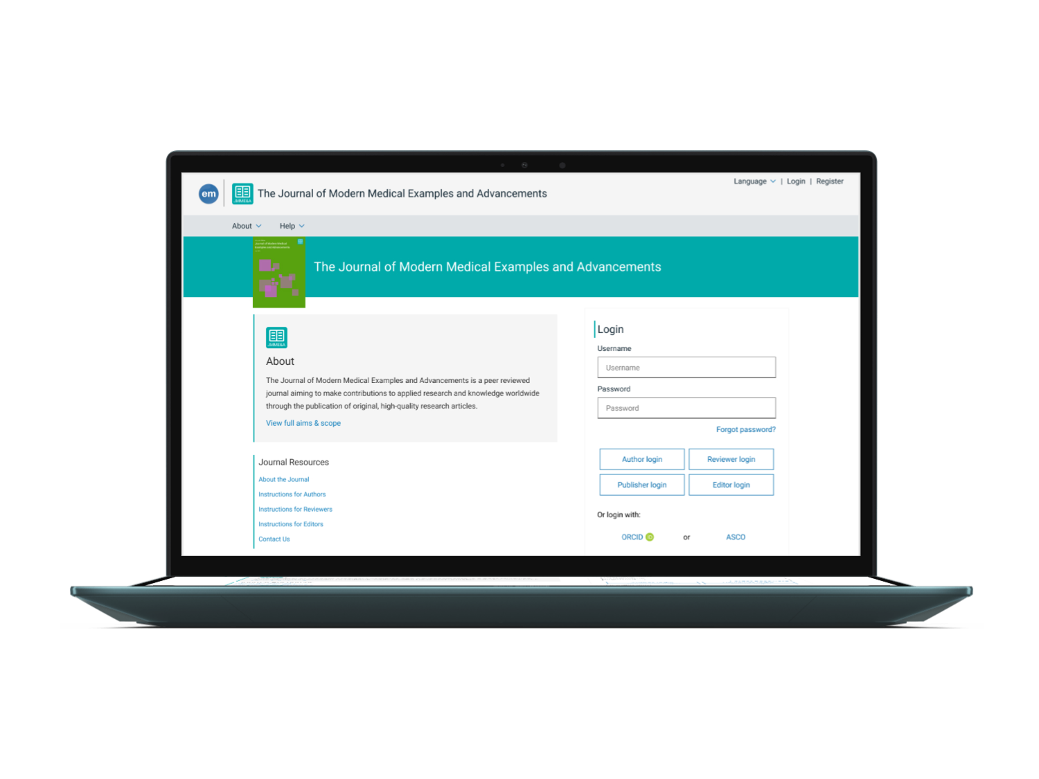
New Homepage design
Phased project plan
Phase 1 - Login frame

Phase 2 - Entire default homepage
The challenges
Designing in a Complex Ecosystem
EM customers rely on site-level customization and configuration
Concerns from users about losing control over branding and layout
Need to introduce new UI styles without disrupting customer workflows
Represent multiple brands under one system
Build research base for UI only updates

Examples of different custom homepages
Research approach and goals
Understanding User Perception at Scale
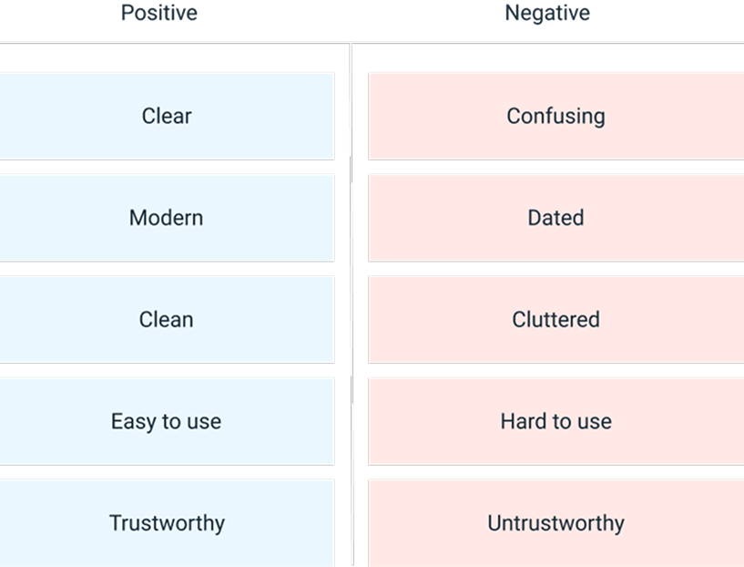
I used the Microsoft Reaction Card Method to evaluate visual updates
Participants compared images of the old vs. new UIs and chose descriptive words
50+ respondents, 70+ open-text explanations
Research Goals
Learn about user perceptions of the homepage
Gauge reaction to visual changes
Identify which issues could be solved with visual updates
Create a repeatable method for future UI testing
Old design results
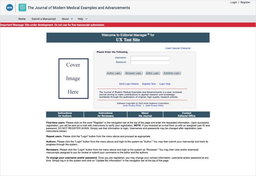
Old design image shown to participants
Old design results
New design results
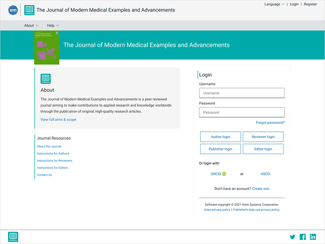
New design image shown to participants

New design results
Final results
User Feedback Showed Clear Gains
Perceived Clarity - 4x more users said the new UI was clear
Modern Feel - 3135% more described it as modern
“Clean” Look - 3527% increase in users calling it clean
Less Confusion - 56% drop in perceived confusion
Clutter Perception - Dropped 89%
4 of the top 5 homepage complaints could be addressed through visual design, and save dev time
Users saw the new UI as easier to use, without changing functionality
Top tagged topics in open response answers
Text* - 20 comments
Dated* - 17 comments
Wordy* - 14 comments
Cluttered* - 13 comments
Login buttons - 13 comments
*Topics 1-4 could all be addressed with UI updates
What’s Next
Using Research to Drive Future Planning
Learnings from this project informed future work centered around removing the multiple login buttons and eventually led to a full scale SSO project from our parent company.
Expand new UI styles across more areas of EM
Use lightweight, scalable research methods for upcoming releases
Maintain customization flexibility while evolving the platform
Continue to position UX as a strategic partner in roadmap planning.
Due to the quality of my research and findings the next project I worked on became the foundation for the product roadmap