Decluttering a busy product navigation
Establishing design processes and kicking off a legacy product’s redesign
Results
Improved navbar usability and cognitive load by decreasing top level options by 40%
Increased text sizes and touch targets to improve accessibility
Created the products first responsive mobile designs
Ran the companies first research initiative, building a model for future feedback collection
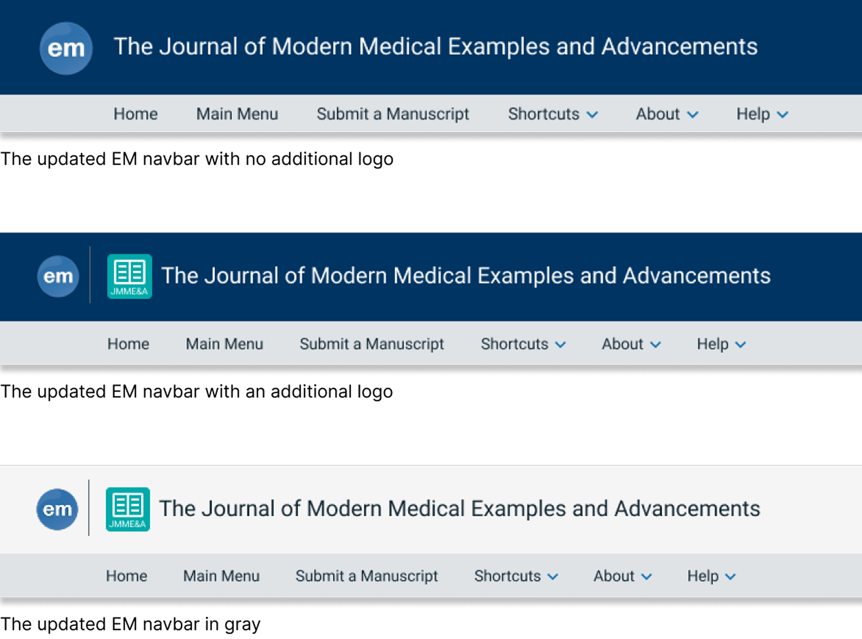
The old EM navbar

The updated EM navbar

Background
I came onboard as the first UX design hire and the sole designer at Aries Systems
Tasked with modernizing the 20+ year old legacy system, Editorial Manager (EM)
Management wanted visible, high-impact projects to show users a commitment to UX improvements
The Navbar is on every page making it the ideal starting point
Challenges
No existing UX team, research, process or practices
Needing to rely on internal knowledge and assumptions due to the lack of research
Dated interface with inconsistent styles
Cluttered navigation and poor accessibility
Technical limitations and coupled pages made changes risky
Heavy reliance on user muscle memory, and users that were resistant to change
Cleaning up the available options
Due to a lack of research I used my best judgement to group related items into dropdowns to reduce clutter
Balanced user expectations with a more intuitive navigation experience, leaving room to scale
Dropdown grouping examples
About - Customer content such as overviews, custom role instructions, and contact information
Help - System resources including the EM help website and tutorial videos
User - Content related to the user's account, such as updating information or switching roles.

Setting UX foundations and creating processes
Partnered with internal teams to identify customers open to low-effort feedback initiatives
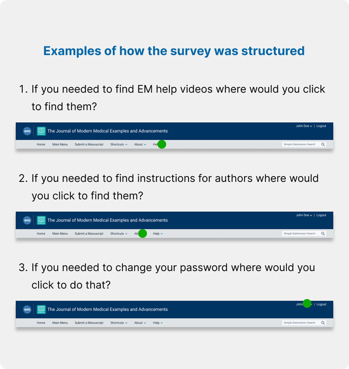
Developed Aries’ first UX research survey
Tested a clickable prototype with users to validate my navbar content placement
Built trust with users and internal stakeholders
Established a repeatable research model for future UX projects
Helped build our reputation as a user focused product development company
Supporting responsive design
EM was historically desktop-only
Usage data showed increasing mobile access
The new navbar became Aries’ first responsive, mobile-friendly UI
This set a precedent for cross-device usability in projects going forward

Controlling customization to improve accessibility
Customers had unlimited control over colors, logos, and images on their sites
Resulted in unreadable combinations and inconsistent branding
Improved readability, brand consistency, and accessibility via customization constraints
One custom logo per site
Text and background color limited to Aries blue or neutral gray
Increased spacing and font sizes

Design as a process, not just deliverables
This project wasn’t just about the Navbar
It was about embedding UX processes into the product development life cycle
Proved the value of user research, design systems, and accessibility
Laid the foundation for a scalable, user-centered design culture
Results
Redesigned Navbar with modern styles setting the foundation for a unified design system
First responsive mobile UI in the platform, enabling mobile and multi-screen support
Initiated Aries’ first user research process, building a model for future feedback collection
Technical enhancements that paved the way for broader system improvements
Consistent styling across customer-branded sites
Improved accessibility with standardized, readable design elements