Generative discovery research
A year long research initiative focused on system usability
Results
What We Learned
Targeted improvements to the information architecture, data display, and technical abilities could increase editor efficiency and speed, improving overall user satisfaction and creating space for more workload.
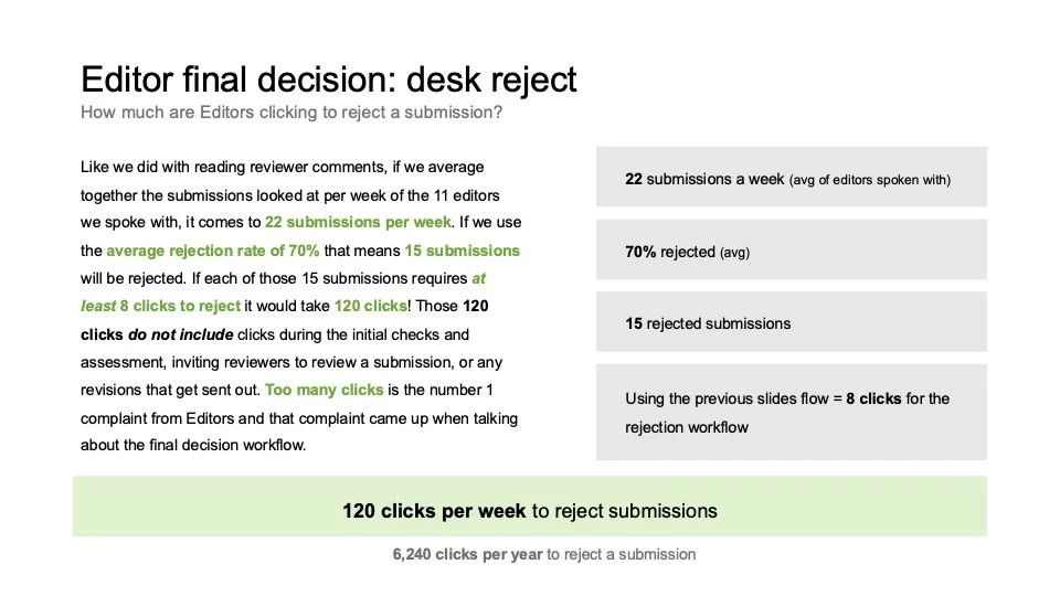
Redundant steps are leading to up to 30–40% unnecessary clicks in certain workflows.
Consolidating options in certain flows will create clearer understanding, reduce redundancy, increase efficiency and reduce the need for workarounds.
Improving labeling, language, and overall messaging in the editorial workflow will reduce user confusion and increase user confidence in the system.
There are multiple opportunities for automation to increase work speed and reduce mental load.
What We Did
Interviewed 40 editors from different disciplines and journals.
Observed how they triage submissions, make decisions on how to progress submissions, and how they invite reviewers for peer review in Editorial Manager (EM).
Collected direct feedback on usability, editor mental models, and system pain points.
Mapped and compared inconsistencies across sites and workflows.
Delivered prioritized recommendations to streamline workflows, standardize decision terms, and enable automation.
Created a 100+ page report to communicate findings. Executive summaries were created for higher up stakeholders.
This work became the foundation for the Product Roadmap going forward.
The Problem
Scholarly Journals are noticing an increase in the amount of submissions they are receiving. This increase isn’t necessarily leading to an increase in higher quality submissions and is creating more work for Editors, who feel overwhelmed by low quality and out of scope manuscripts.
We wanted to learn how editors are handling this increase in submissions and if there are any inefficiencies in our system that could be improved to help them do their jobs.
The Approach
We ran three phases of qualitative usability and discovery research:
Phase 1 – Editorial Triage
Phase 2 – Editorial Decision Making
Phase 3 – Reviewer Invitation & Job Switching
Methods
Semi-structured interviews, contextual inquiries, live task walkthroughs, cross-site comparisons, and workflow mapping.
Participants
40 total users with Editor roles in EM (Editors-in-Chief, Managing Editors, Associate Editors). All across different disciplines and geographies.
The Different Project Phases
Phase 1 - Editorial Triage
How editors initially assess new manuscript submissions.
Participants
13 Editors
What We Explored
How editors decide whether a submission should move forward or be rejected early.
The tools and workflows editors use to check formatting, scope, novelty, and ethics.
How workflows align with editors’ mental models.
Next steps for in-scope submissions
Phase 2 - Editorial Decision Making
How editors make formal decisions about manuscripts after assessment or peer review.
Participants
11 Editors
What We Explored
The usability of workflows for desk reject, revision, transfer, and acceptance decisions.
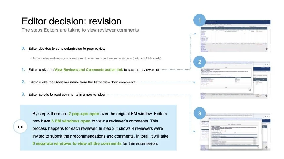
How editors review and interpret peer reviewer comments.
Communication flows between editors, authors, and reviewers.
Phase 3 - Reviewer Invitation & Job Switching
How editors find, invite, and manage reviewers, and how they switch between other editorial jobs.
Participants
16 Editors
What We Explored
Reviewer search and invitation workflows.
Reviewer management after invitations are sent.
The experience of switching between different submissions and tasks within EM.
Key Findings
Phase 1 - Editorial Triage
How editors initially assess new manuscript submissions.
Results
1. Manuscript triage
Editors often work in batches to reduce context switching.
Managing Editors handle admin checks (files, formatting, compliance) but often lack tools to do so efficiently.
EiCs focus on research quality, novelty, and scope
Rejection reasons:
Scope misfit or “nonsense” papers.
Lack of novelty.
Flawed methodology.
Ethical concerns (plagiarism, duplicate submissions).
2. Editor assignment
Generally quick, but EM’s long, unsorted lists of editors slow down the process.
Editors often maintain spreadsheets outside EM to track workloads and assignments
Confirmation steps in EM add unnecessary extra clicks.
3. Workflow pain points
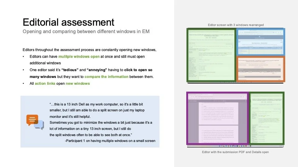
Editors open 3–8 action links per assessment, each in a new window, leading to clutter.
The Details page requires excessive scrolling and doesn’t align with editorial priorities.
Custom flags are widely used but inconsistently applied and not always updated automatically.
Formatting checks (line numbers, word count, image quality) and author validation are time sinks that could be automated.
Phase 2 - Editorial Decision Making
How editors make formal decisions about manuscripts after assessment or peer review.
Results
1. Click-heavy flows
Viewing reviewer comments requires up to 35 clicks per week per editor (best case scenario), over 1,800 clicks annually just for this task.
Desk rejections averaged 120 clicks per week for a typical editor workload.
2. Fragmented communication
Decision terms varied across journals; lack of standardization made editor–author communication inconsistent.
Editors often wrote decisions in Word/Excel to manage clarity and reuse phrasing.
3. Misaligned information architecture
“Action links” did not follow editors’ natural assessment process.
Many editors resorted to external spreadsheets for assessments due to EM’s lack of autosave and inability to compare multiple submissions side by side.
4. Accessibility & usability issues
Poor contrast ratios (1.08:1 vs WCAG’s 4.5:1 requirement) hindered readability.
Hover targets for collapsed menus were too small, leading to mis-clicks.
Phase 3 - Reviewer Invitation & Job Switching
How editors find, invite, and manage reviewers, and how they switch between other editorial jobs.
Results
1. Reviewer search
Editors have access to 5–7 search tabs which lack clear labels and have different operating functions (tabs vs. buttons).
Editors unsure of available search options
Editors repeated searches across tabs to check results, adding unnecessary steps.
2. Reviewer results & invitation flow
Editors often distrust EM’s reviewer information and rely on external tools (Excel, PubMed, Google Scholar) to verify accuracy.
The results page has poor visual hierarchy and duplication of data.
The proceed button is located at the bottom of the page, requiring excessive scrolling (up to 9 seconds to reach when results showed 100 reviewers!).
Assigning roles and customizing invitation emails required 15–25 clicks per invitation. There are no “Apply to All” options.
3. Errors & system feedback
Editors were unsure whether reviewer invitations had been successfully sent when errors appeared.
Unclear labels like “Un-invited before agreeing” and “Terminated” caused confusion about reviewer status.
Editors often didn’t realize the Cancel button would take them back to the Reviewer Selection Summary page (first page in flow), leading to 3+ extra clicks.
4. Job switching & navigation
Moving between submissions required returning to the Main Menu, taking editors out of the flow and adding multiple clicks per transition.
Editors described the Main Menu as cluttered and inconsistent (“mystery folders”), requiring trial-and-error learning.
Some editors opened 3+ EM tabs or used external notes to avoid losing track of manuscripts.
Small click targets (e.g., action links) and non-responsive text created friction and accessibility issues, especially on laptops or zoomed screens.
5. Reviewer Management
High-volume editors used Excel or personal email because EM’s status tracking was limited or hard to read.
Features like auto-uninviting or alternate reviewer promotion were inconsistently applied or poorly understood.
Editors saw higher response rates when manually emailing reviewers than when relying on EM’s automated reminders.


