Improving the product experience for reviewers
Simplifying flows, complex tables, and improving site access
Results
Improved efficiency for reviewers by reducing steps in flow by 25%
Reduced the mental load for reviewers by focusing on important information, backed by user research
Created responsive designs to accommodate increase in mobile usage
Improved accessibility concerns by increasing touch target sizes
Project overview
Recent initiatives by our parent company made us prioritize improving reviewer access
The reviewer role was historically overlooked when it came to product improvements
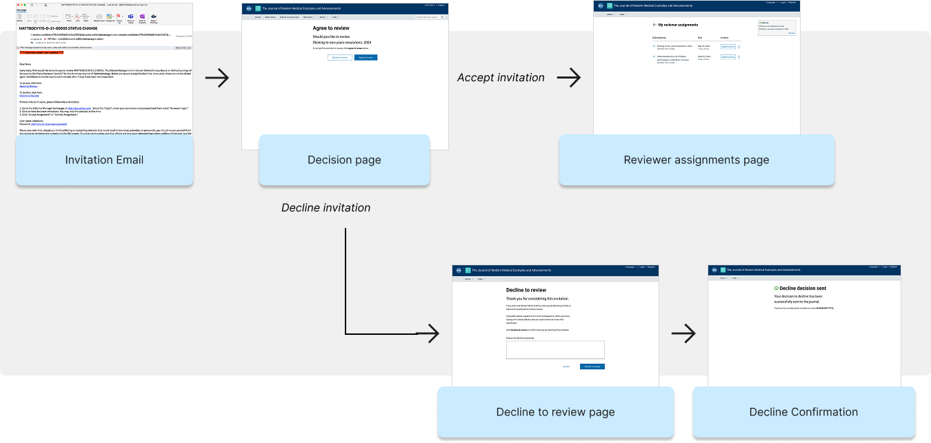
We examined how reviewers accept and decline invitations to review submissions
Broader questions raised about how reviewers interact with the system

Key insights from a survey I created and sent to reviewers about the workflow. I collected feedback from 20 users.
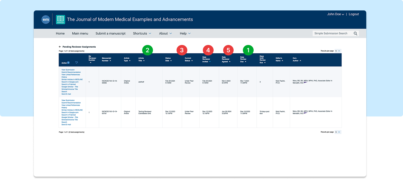
Reviewers care most about
1. Review due date
2. Article title
Reviewers don’t need to see
3. Submission status
4. Date invited
5. Date agreed
Feedback suggested
The page contains too much information
Users want simplified views
Accessibility concerns
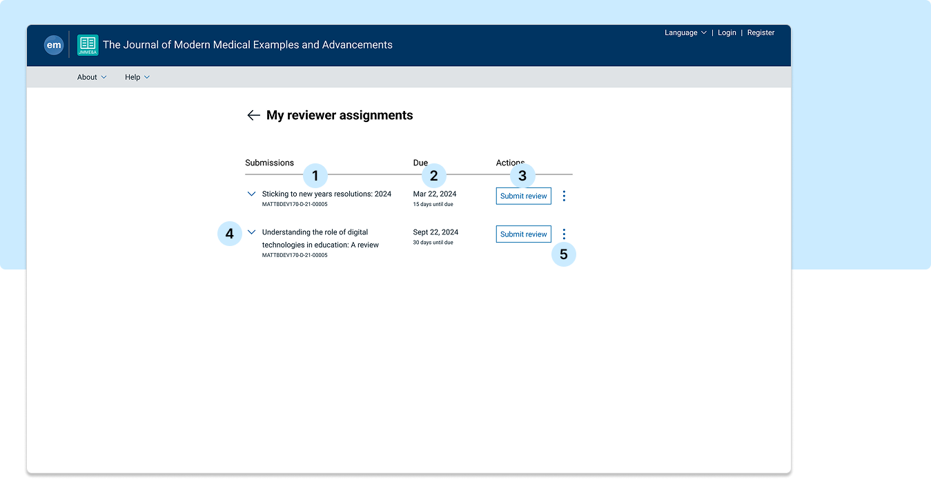
Cleaning up complex tables for easier use
3 columns
Research based decisions on what info to focus on
Ability to expand to see more info
Responsive designs for mobile
Most important action featured
13 columns
Unnecessary information
Too much text
Not responsive
Long list of links, hard to scan
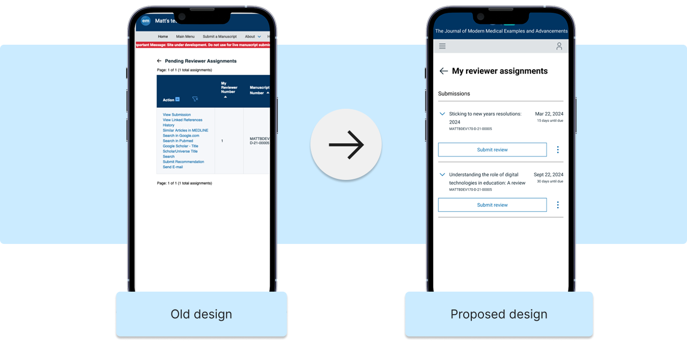
The new simplified view
Submission article title
Review due date
Primary reviewer action
Expand option to show/hide additional details
Overflow menu to reveal available secondary actions
New features help retain secondary information


Growing need for mobile designs
Data was showing users were using mobile devices to access workflow
Needed responsive designs to accommodate this user behavior
New simplified view works on mobile
Mobile, tablet, desktop views

The mobile design
Responsive
Designed for mobile use
Easier to scan and see all info
Most important info featured
Not responsive
Accessibility issues
Hard to read
Unnecessary information