Creating a design system
Modernizing legacy software and improving usability
Results
An immediate 23.33% increase in user satisfaction for projects using the new styles
Users polled described the new styles as Clean, Modern, and Clear compared to the old styles
Projects using the new styles fixed up to 10+ accessibility issues
Editorial Manager (EM)
20+ year old scholarly publishing submission system
Highly customizable and configurable
Inconsistent
Issues
Outdated UI
Complex workflows
Visual inconsistency
Minimal brand presence
Goals
Modernize the UI
Improve usability
Increase user satisfaction
Examples of old EM designs

Challenges
No existing user research
Multiple conflicting design styles
Needed to support multi-brand flexibility
Align with parent company branding
Preserve deep customer configurability

Line height was used to align brands and create visual consistency
Areas of alignment across design systems
Text styles and sizing
Page grids
Content spacing
Page layout
Using neutral colors on certain components
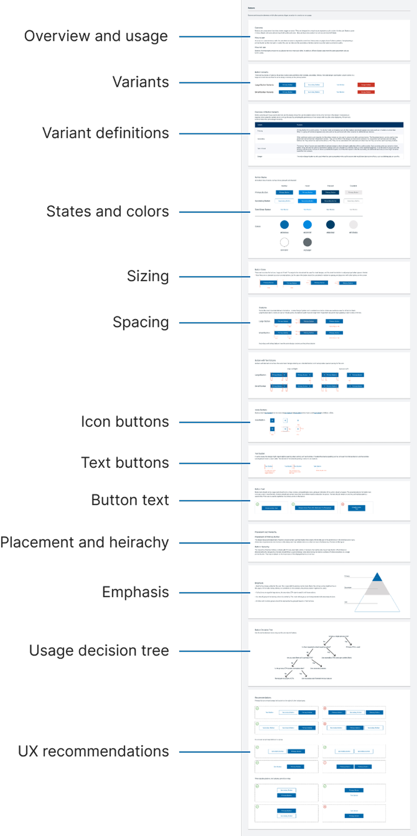
Creating components: Buttons
Button component results
4 variants to align with page action priority
Visual alignment with the main company, parent company, and designed to work with third party brands
New variant, a danger variant, which was created and then adopted by the parent company for their design system work
Usage guidelines established for devs and designs working on these in the future
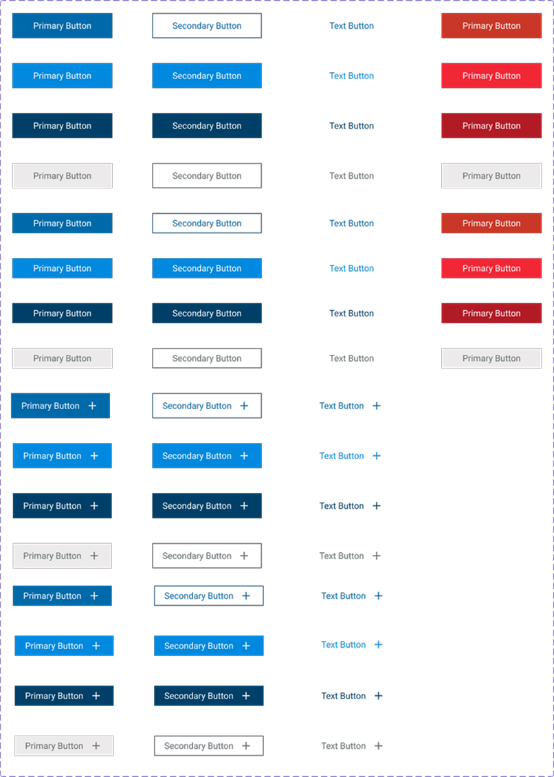
Examples of primary, secondary, text and danger button variants
Usage Guidelines
For each component, detailed usage guidelines were created to ensure there would be correct and consistent implementation across projects.
What Usage Guidelines Covered
Design specs - spacing, color, typography, states, and variants
Usage rules - when and how to apply each component
Recommendations/Accessibility considerations - color contrast, keyboard nav, ARIA roles
Audience - written for both designers and developers
16 sets of guidelines were created to support scalable, brand-aligned, and accessible design.
Results
An immediate 23.33% increase in user satisfaction for projects using the new styles
Users polled described the new styles as Clean, Modern, and Clear compared to the old styles
Projects using the new styles fixed up to 10+ accessibility issues
Elements of the new visual styles emerged even before official work on the design system began. Over the course of a year, a contract designer and I contributed to the design system intermittently, refining components, fine tuning the usage guidelines, and establishing visual consistency.
Eventually, the business recognized the need for a more unified approach across its entire product suite and our parent company opted to pursue a single, consolidated design system. Work on our design system was paused but eventually incorporated into this broader initiative, where the work was used for the new unified system.
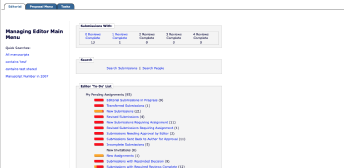
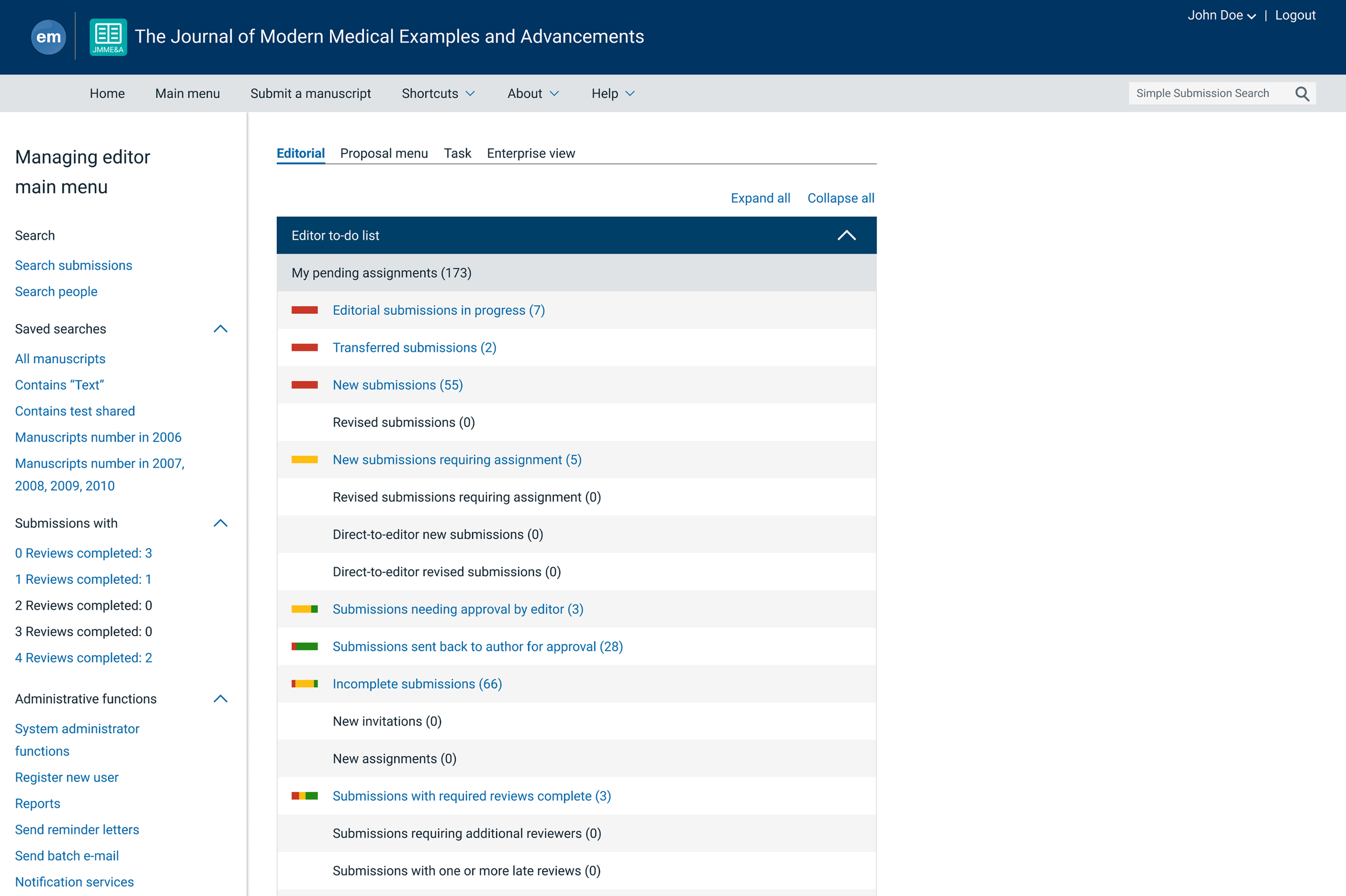
The Editor Main Menu using the new design system styles
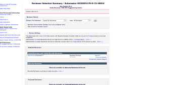
The Reviewer Selection Summary page using the new design system styles
